Some side intrests: carpentry/remodeling and photography
Friday, November 2, 2007
Tuesday, October 23, 2007
Portfolio: The Jackson on High
The Jackson on High: Condos/Retail Use
Project Role: Drafter/Project Coordination
For the most part, this project was developed/designed when I began working at the firm. My role was to assist in the documentation and coordination of different issues with the project. The project has many design elements that proved new and challenging for me, such as a roof top pool with operable skylight as well as many interior custom details. A large majority of the coordination occured with structural engineers as well as the mechanical engineers, determining the correct sizing of steel members as well as coordinating the HVAC layout.
Enlarged Images for Clarity:
Plan:
Elevation:
Details:
Renderings:
Portfolio: Professional Work - Erie View
Erie View: Condo Project
Project Role: Drafter/Designer (Int. Units)
The project as it stands is currently under re-design due to several factors (i.e. additional site being acquired). The elements that I focused on were the interior layouts of the individual units as well as working on the elevations and how the different elements fit together. The focus of the design issues on this version mainly rested on whether the two buildings should be connected together, the amount of curtain glazing (project located several blocks from Lake Erie) on the penthouse level, and the height relationship between the two buildings. These issues are being discussed along with the potential of additional land for the building.
Enlarged Images for Clarity:
Plans:
Elevations:
Renderings:
Saturday, October 20, 2007
Portfolio: Professional Practice - The Heights
The Heights: Condo/Retail Project
Project Role: Designer
The project is situated in the 'downtown' area of Grandview Heights, a suburb of Columbus. The project contains both retail (bottom floor) and condos on the remaining floors above. The client wished to create a building that utilized more traditional elements on the exterior, such as the mansard roof, bracket and cornice detail, quions, etc. However, the interiors are characterized with more modern elements, high ceilings, fixtures, appliances and finishes. Two challenging aspects of the project were the limited size of the site as well as the existing fabric of the area, where the buildings were predominately smaller in scale. The solutions to both problems came in the massing and articulation of the building and its features (i.e. glass projection, solid base and stepping back the condo portion, material choices).
Enlarged Images for Clarity:
Typical Floor Plans:
Elevations:
Renderings:
Photos:
Sunday, September 23, 2007
Portfolio/Studio Final: Plans
The first floor contains two main program elements, the gallery and the cafe. The intent is to have a very open ("light base") and inviting first level, so that it encourages the local community to inhabit the gallery and cafe and interact with the students participating in the distance program. The cafe would only serve drinks and pre-made sandwiches/meals, so that major kitchen appliances would not be needed. The intent of the gallery is to reflect the virtual world - all work exhibited on lcd panels, rather then a traditional gallery where prints dominate the spaces. The main entry is located at the recessed courtyard, similar to the approach at the rear of the building. The front entry is meant to be somewhat compressed, where the visitor is surrounded by the mass of the building (heavy top) as opposed to the rear which is open and only bounded by the landscaping and the transit system (juxtaposed quiet vs. noisy entry).
The basement contains only components for the geo-thermal pump, pumps for heating and cooling (hydronic system) and the cistern.
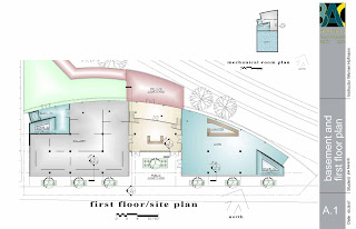
The second floor is recessed back in plan, allowing for a green space for the students to occupy, a place of relaxation and decompression from the rigors of the intensive sessions, while maintaining a full height curtain wall.
The third and fourth floors are designed to be more solid in nature (metal panel rainscreen), to limit the amount of attention/viewing into these very private areas. The plans allow for shared dorms with seperated sleeping quarters (for comfort and area of privacy) - see enlarged plans. The recreation area is a double height space (enclosed in a glass box - serves as a smoke barrier) that contain various items couches, pool tables and various other equipment.
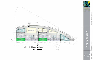
The layout of the studios allow for a work table for computer work and model making or drawing. The intent is to group students for interaction and collobrative efforts with studio design projects.
The basement contains only components for the geo-thermal pump, pumps for heating and cooling (hydronic system) and the cistern.
The second floor is recessed back in plan, allowing for a green space for the students to occupy, a place of relaxation and decompression from the rigors of the intensive sessions, while maintaining a full height curtain wall.
The third and fourth floors are designed to be more solid in nature (metal panel rainscreen), to limit the amount of attention/viewing into these very private areas. The plans allow for shared dorms with seperated sleeping quarters (for comfort and area of privacy) - see enlarged plans. The recreation area is a double height space (enclosed in a glass box - serves as a smoke barrier) that contain various items couches, pool tables and various other equipment.
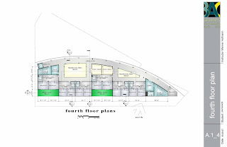
The layout of the studios allow for a work table for computer work and model making or drawing. The intent is to group students for interaction and collobrative efforts with studio design projects.
Portfolio/Studio Final: Site and Plan
Site Plan:
The prime factors in the landscape plan were motivated by green principles - a key concept within the project framework. Materials and methods that contribute to the site include, pervious paving, local vegatation, water retention, and solar panels. The pervious paving system along with the introduction of local vegatation allows water to permeate the site and be reintroduced to the water table (filtered via gravel system in paving system). Local vegatation that is hearty and low maintance would be introduced along the rear (North) of the building, which would allow for a micro ecosystem to develop in the spring and summer months. Evergreens would be planted along the North perimeter of the site, which has two benefits, it would act as another edge along the transit system - help reduce noise, and act as a year round barrier for the building (from colder northern winds). The terrace at the rear of the building would act as a gathering space for students as well as acting as a rear entry, while allowing motorists a small glimpse into the spaces inside the building. Along Boylston, decidious trees would be planted, to help shield the summer sun while allowing winter sun to penetrate into the space for heating purposes.
Roof Plan:
The key items to note are the p.v. panels and the green roof system. The p.v. panels are mounted to the roof, oriented to the South (angle maximized for summer sun), for maximum efficiency. The p.v. panels are meant to augment the dependence on the grid - one key benefit is net metering when the building has limited use. Net metering would allow the BAC to sell back energy to the utility company. The green roof system is meant to help retain water, preventing the need to tie into the local storm drain system. The remainder of the water (coming from areas containing the pv array) would tie into a cistern below grade, for introduction into the building as "grey water."
Portfolio/Studio Final: Elevations
North Elevation: The main feature of this elevation are the two "billboards." The idea behind the billboards is to display the work of the students via there blog entries. The notion of having students in various timezones offers notion of work being produced around the clock - allowing the billboard to be updated on a continous basis (on a loop). The lower level (cafe and gallery) of the North elevation is wrapped in a curtain wall, allowing views in and out. The middle floor allows a view out from a "lobby/pin-up" area along the circulation path - a more controlled view in and out. The top two floors allow only a small ribbon window along the corridor.
South Elevation: The main idea behind this reflects the notion of the elevation parti diagram - a heavy top and light base. This reflects the idea of allowing for a public interactive area (cafe and gallery) and and the more private area for the students on the upper levels (studios and dorms).
Subscribe to:
Posts (Atom)